  Refrences 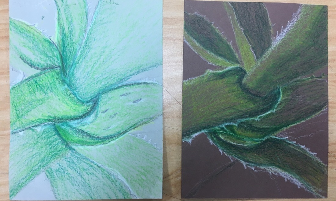 compositional sketches 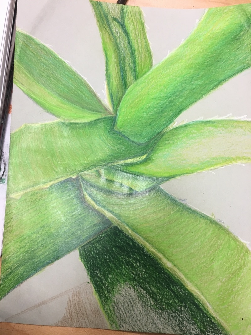 in progress 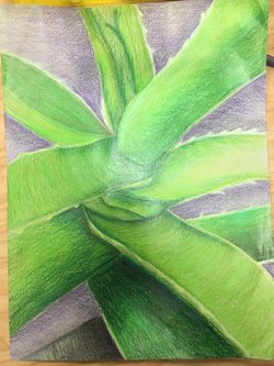 complete complete Critique Questions:
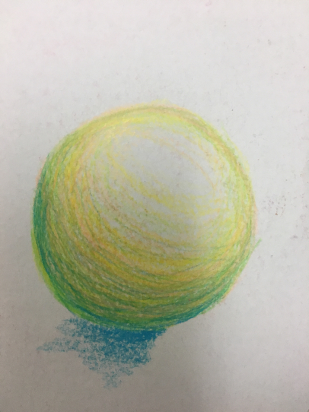
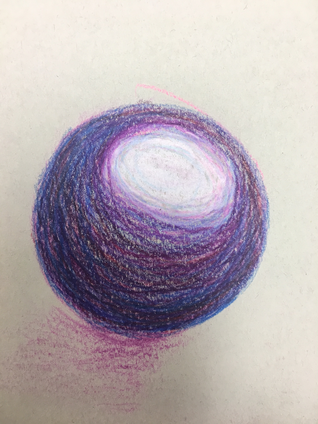
1. I think overall, the craftsmanship of my drawing is good. I tried to make it as neat and well executed as i could, by drawing the shapes and highlights before i went in with the prisma color. I like the way the picture looks as a whole. 2. I definitely created a full range of values in this piece, I used light greens, dark greens, turquoise, blue, purple and black for the shadows and a lot of yellow and white for the highlights to create the illusion of depth and to create the realistic factor. 3. I represented O'keefe in my art by choosing my own picture of a natural object, aloe, as my main focus and zooming into the picture a lot so that in a way, it looked very abstract but you can still tell that it is a real life object. 4. I chose to use a lot of different cool colors to create this piece, by going in first with a medium green and then going in and adding dark green, black, blue and purple for the shadows of the piece and using yellow and white for the highlights. 5. I created contrast by using purple as the background color to make the actual focus of the piece, the plant stand out and create the dramatic factor of it. I also used a large range of colors and shades of colors to create contrast on the aloe leaves. 6. I used texture in my art to create the spikes on the side of the plant and all the little spots that you can see in my reference picture. Highlights and shadows were very important in my piece to create the illusion of the leaves overlapping and to make the art work look a lot more realistic and 3D. 7. I had a few difficulties with this drawing, i found it a struggle to create the effect of the leaves moving backwards and the shapes they actually make in person. I also found it difficult to create the spikes on the edge of the plant, i wish they looked more realistic. I also wish i could've added more detail in the background.
0 Comments
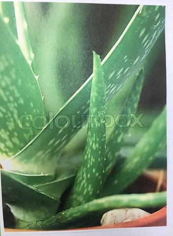
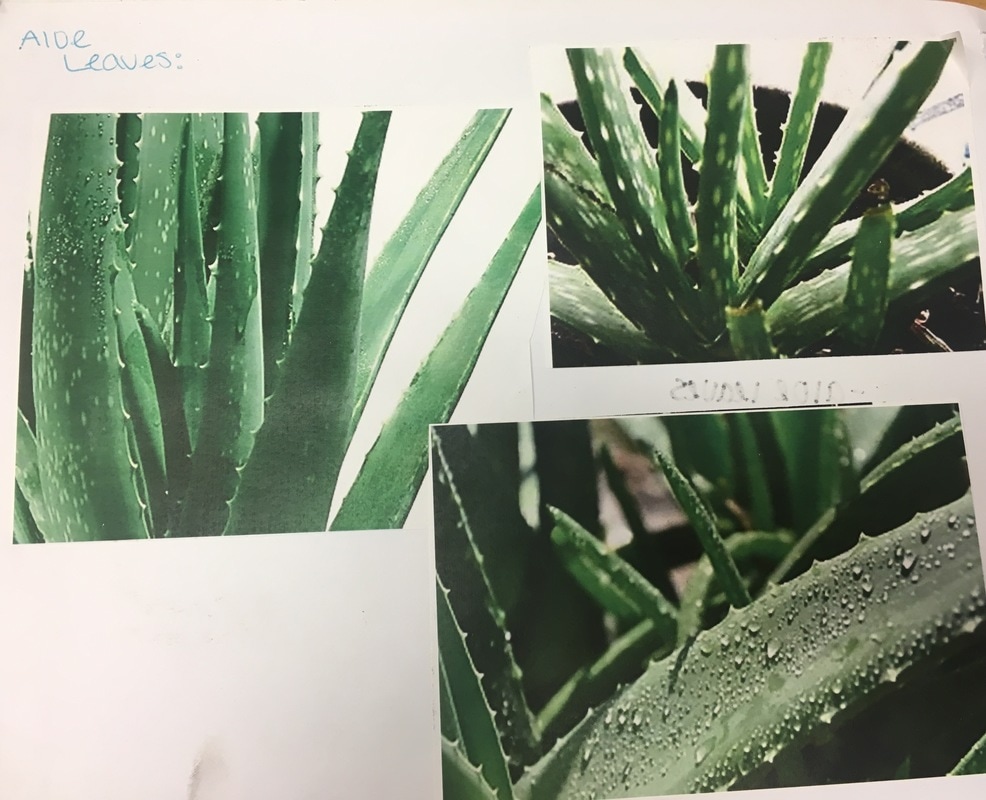
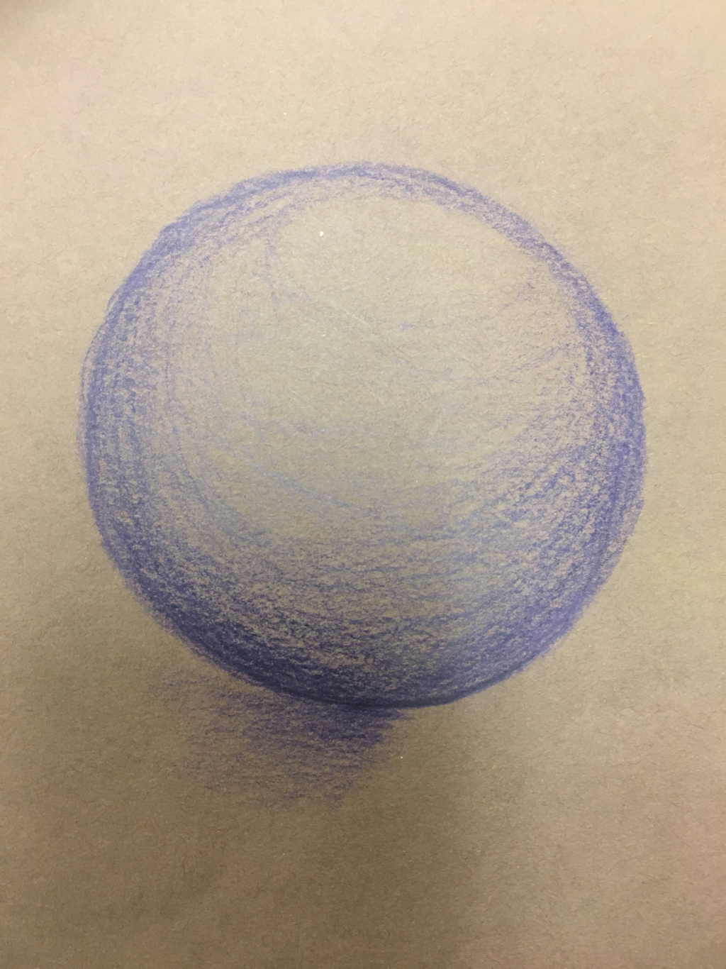
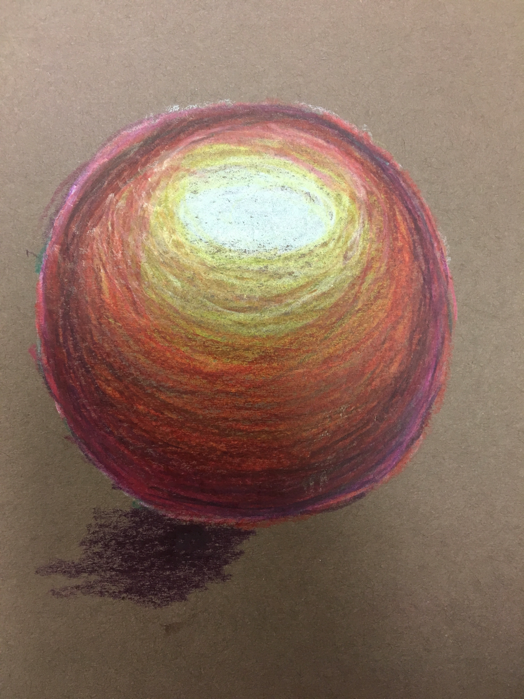
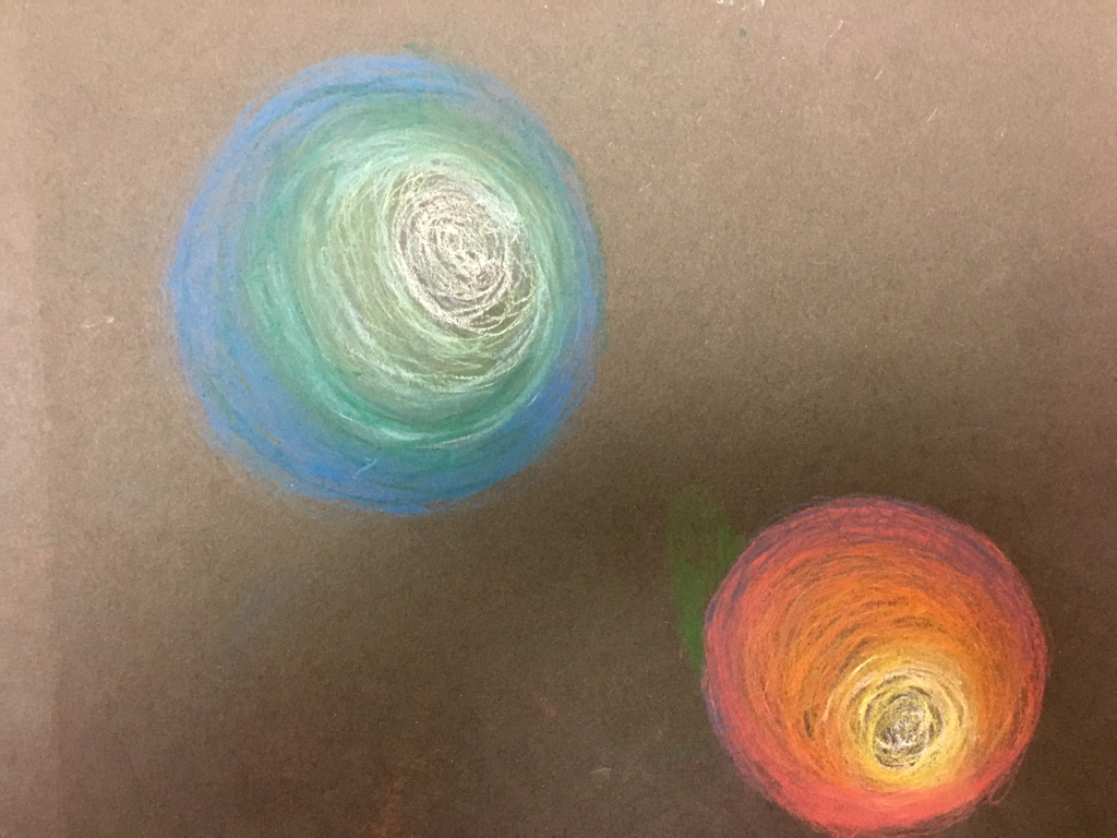
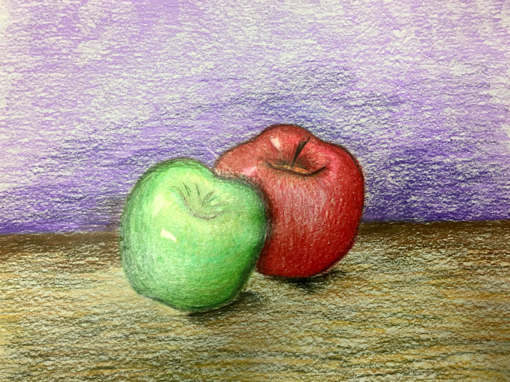
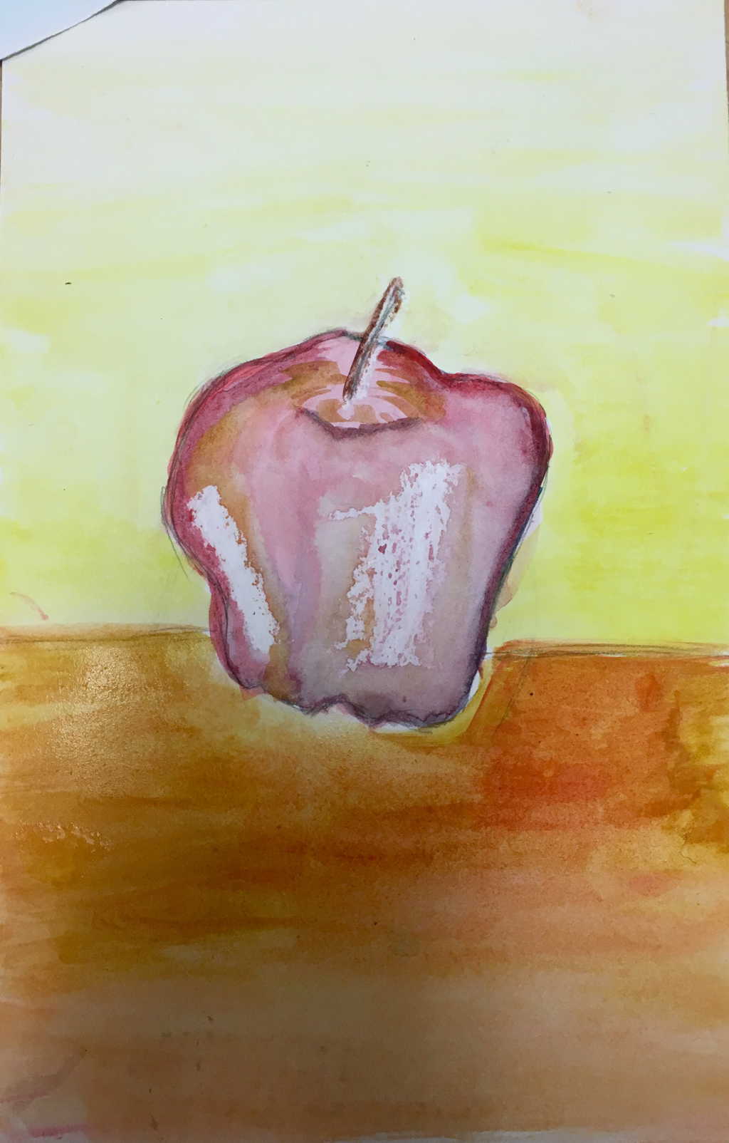 Warm Colors w/ wax technique 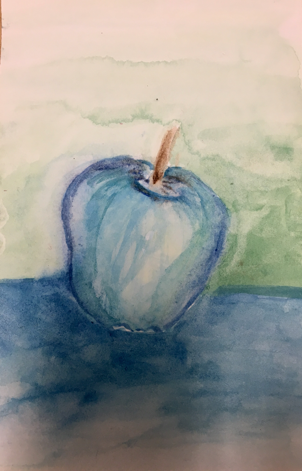 Cool Colors 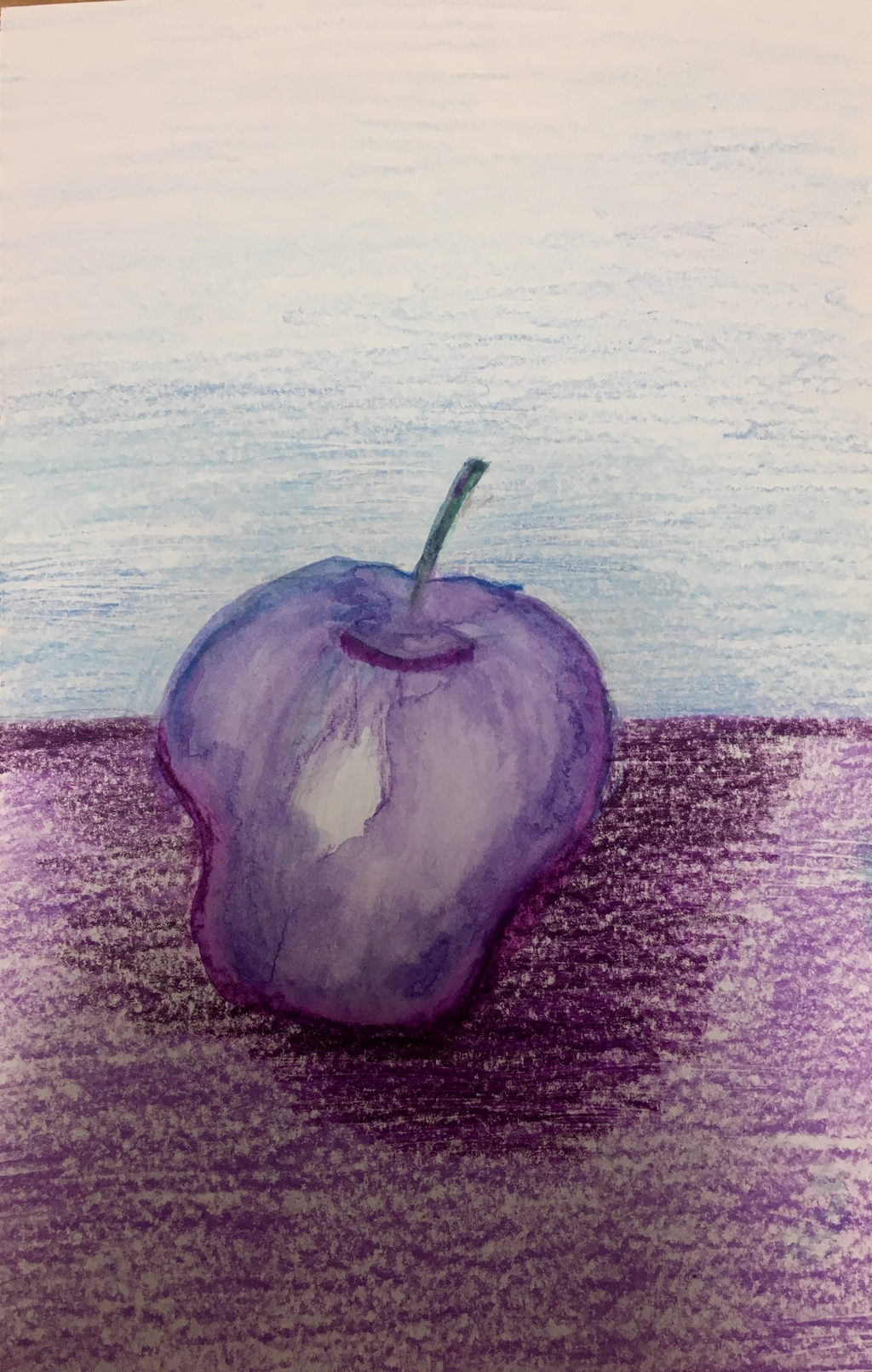 Cool Colors w/ Water color/traditional colored pencil 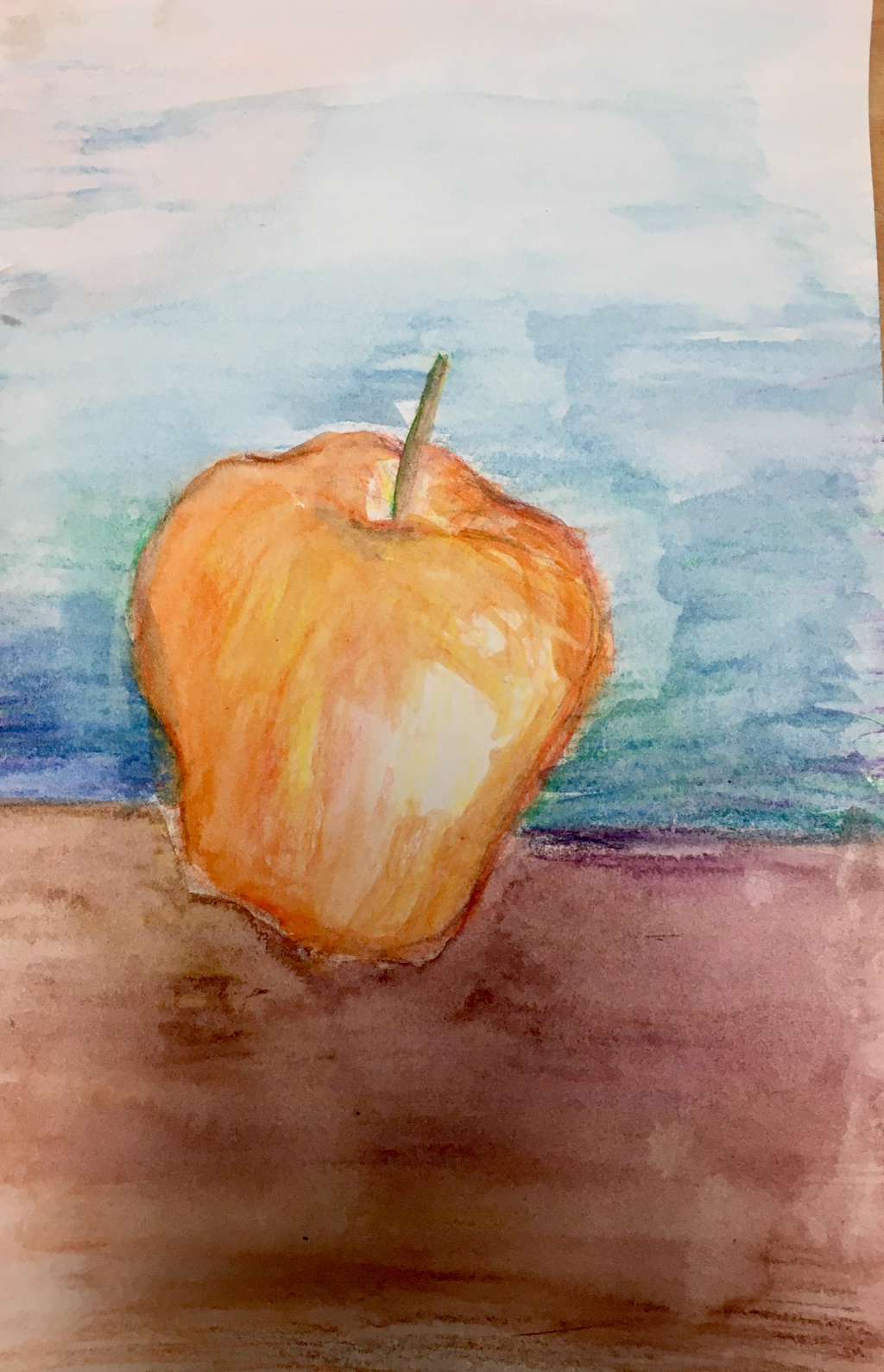 Complimentary Colors w/ water colored pencils
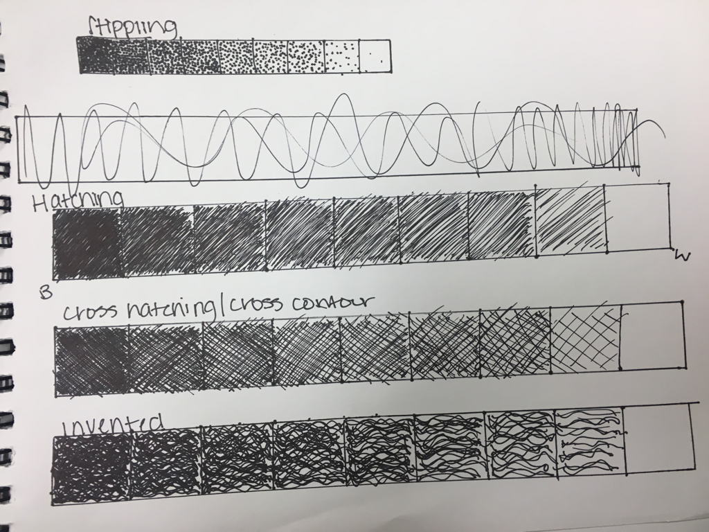
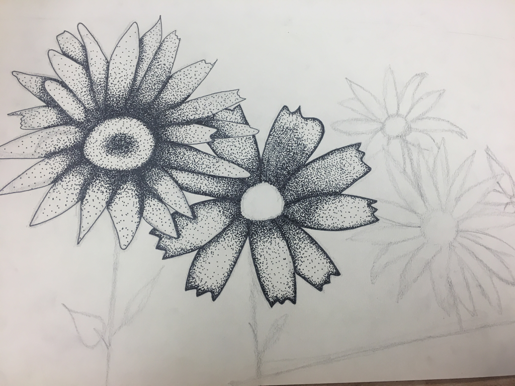 in progress 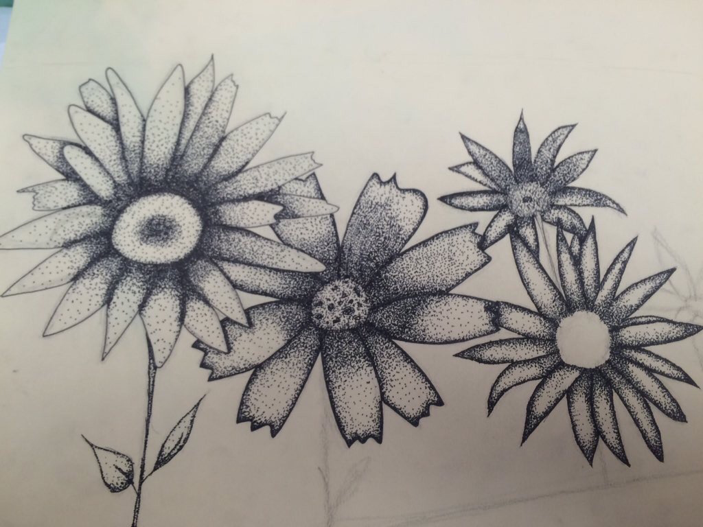 in progress 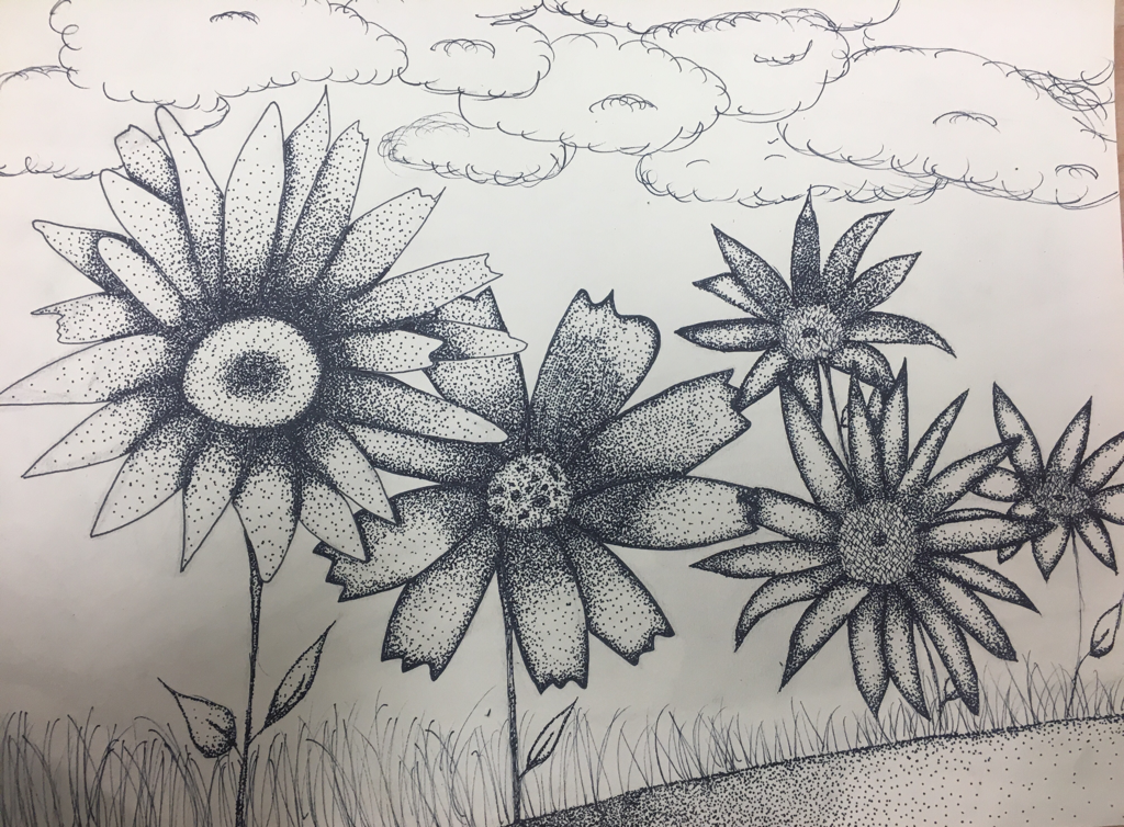 in progress 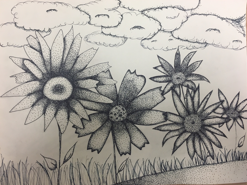 final 1. I chose to use stippling as my pen and ink technique because to me, it's the best way to create value with pen when creating the shapes and textures I was for this project. 2. Texture is definetely important in my drawing because flowers have a lot of texture, the dots from stippling creating a lot of texture that made the drawing look more realistic. 3. It's important because it creates the realistic feel of the piece. The middle of the flowers has a lot of texture and small strokes of the pen combined with stippling adds to that. 4. Value is important in this piece to create the perspective of the drawing and makes the shapes look more 3 demensional. It helped me to create realisticness and overall added to me being happy with my final piece. 5. For this project, i feel as if i could've done better with the craftmenship, i've only worked with pen a couple times and the perspective wasn't as realistic as I had hoped but, it did help me to realize what i should do better in future and good ways to make it look more realistic. 6. If i could recreate this project, i'd work more on the background. I ran out of time and found it difficult to add the smaller flowers in the background, i wish i had maken the flowers bigger so the perspective looked correct. I would've used different pen techniques to add to the value and texture. But overall, I'm pretty happy with the outcome of this drawing. 7. It was really helpful to learn the techniques before we started working on this project, before, i didn't really have any background on working with pen. In art 1 i did a stippling flower and as i compare these two drawings, this one has come a lot farther than the other. The value looks a lot more correct because of the techniques we learned and the practice we had in class. 8. What i learned doing this project is going to be really helpful for me in the long run, i enjoy doing stippling i find it relaxing and i hope to have many more opportunities to work with pen and ink. I feel as I go through this class, i will learn many techniques and skills that will help me as an artist in the future. Working on perspective helped me to learn how to make values more realistic and over all help my art a lot. I am excited to use my learned techniques and skills in the future. 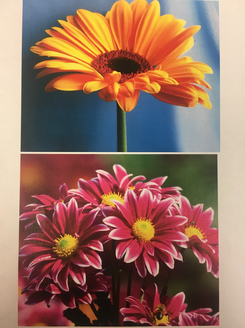 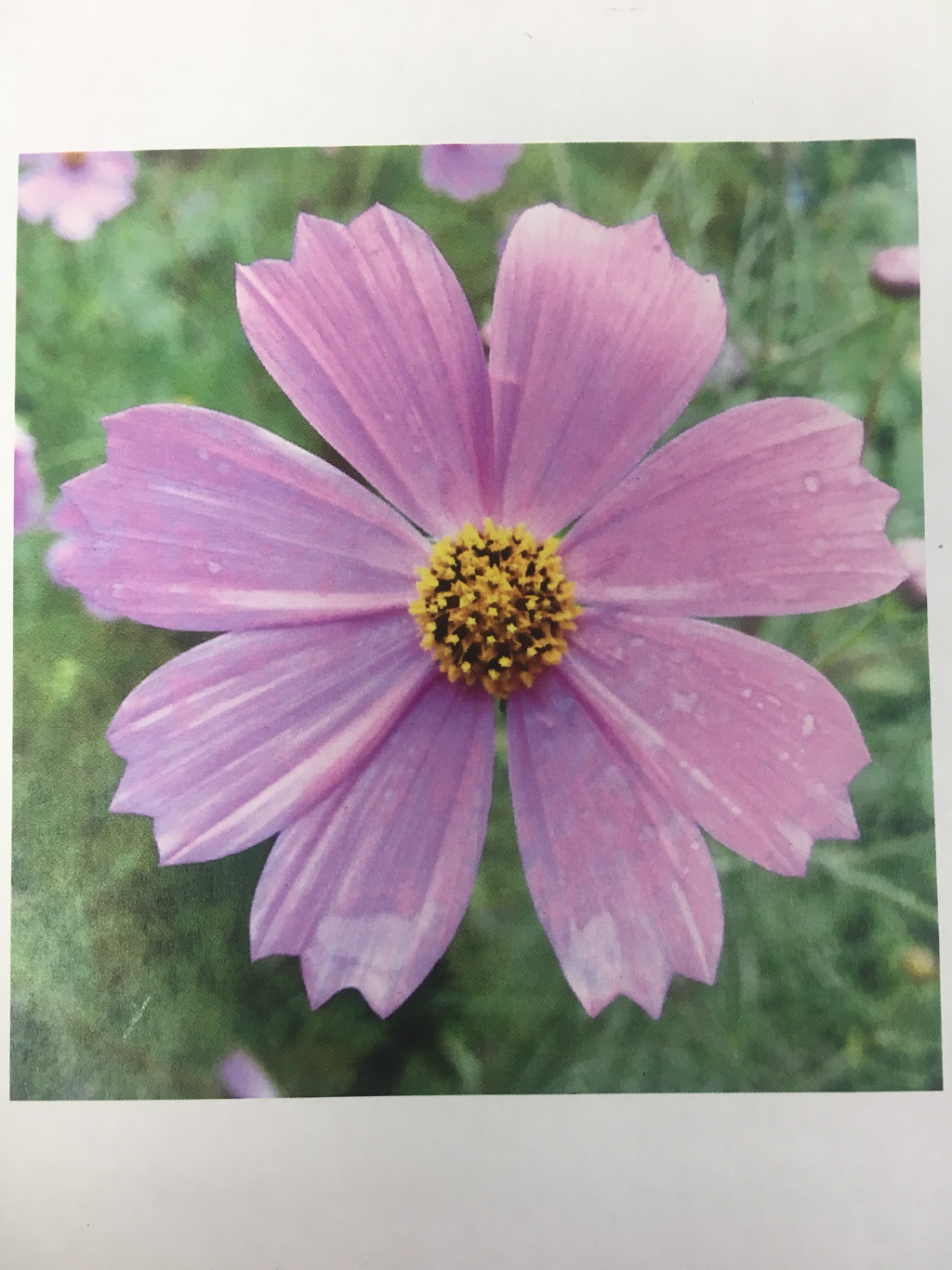 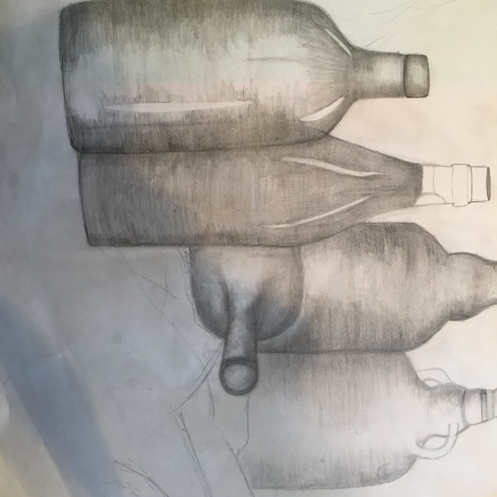 Overall, I think this drawing was a successful compisition because it shows values of the bottles and makes them look 3D, the bottles in the back are lighter then the ones in the front and the shadows on the bottles adds value. I used a range of values, from dark to light , as shown in my drawing on the bottles. I practiced a lot of realistic drawing in Art 1, which included shading and creating values, it really helped me on this project because i had prior knowledge. Values are important to show realisticness and really capture the look of perspective. If i were to redo this drawing i would add more emphasis to the background and maybe do some darker values to enhance the look of this project.
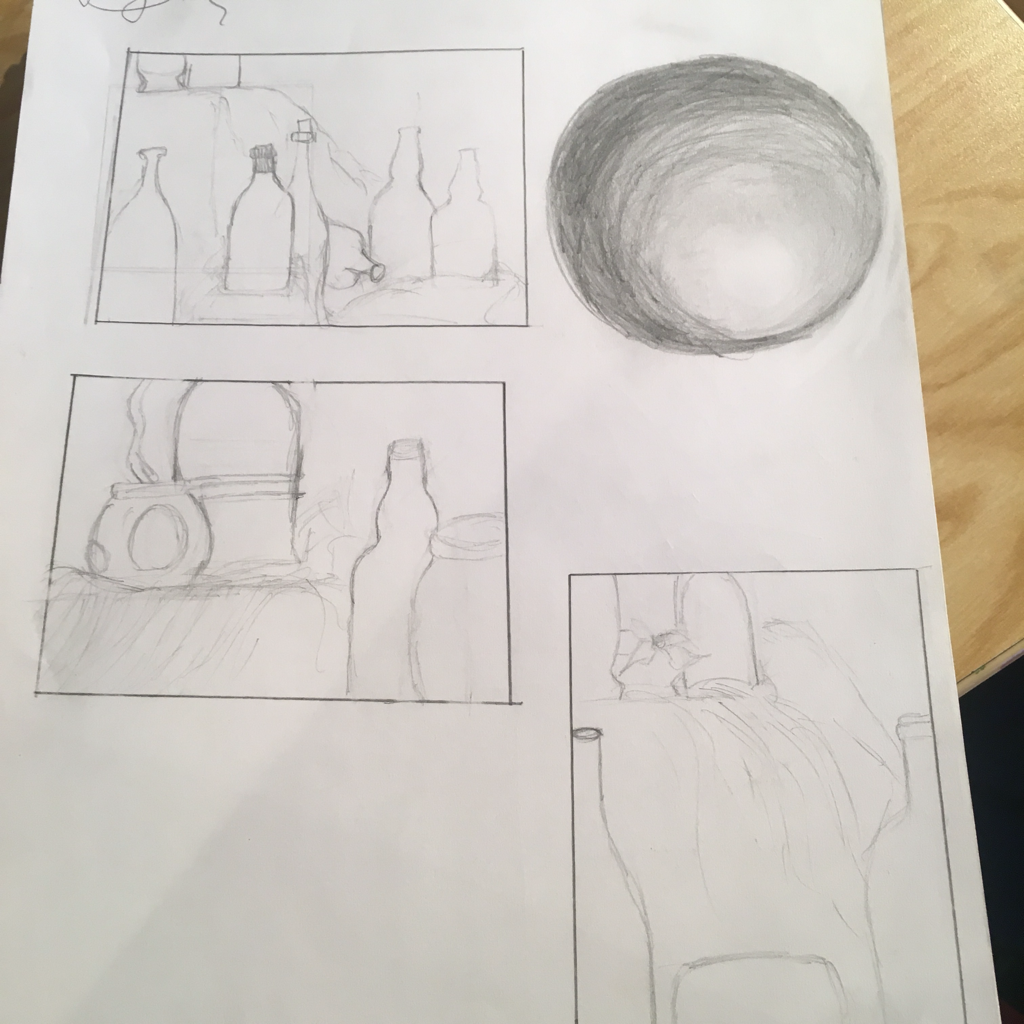 These are my practice drawings for the still life drawing. 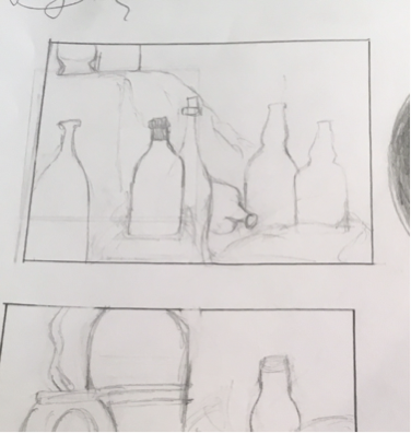 This is the one i chose to pursue in my drawing
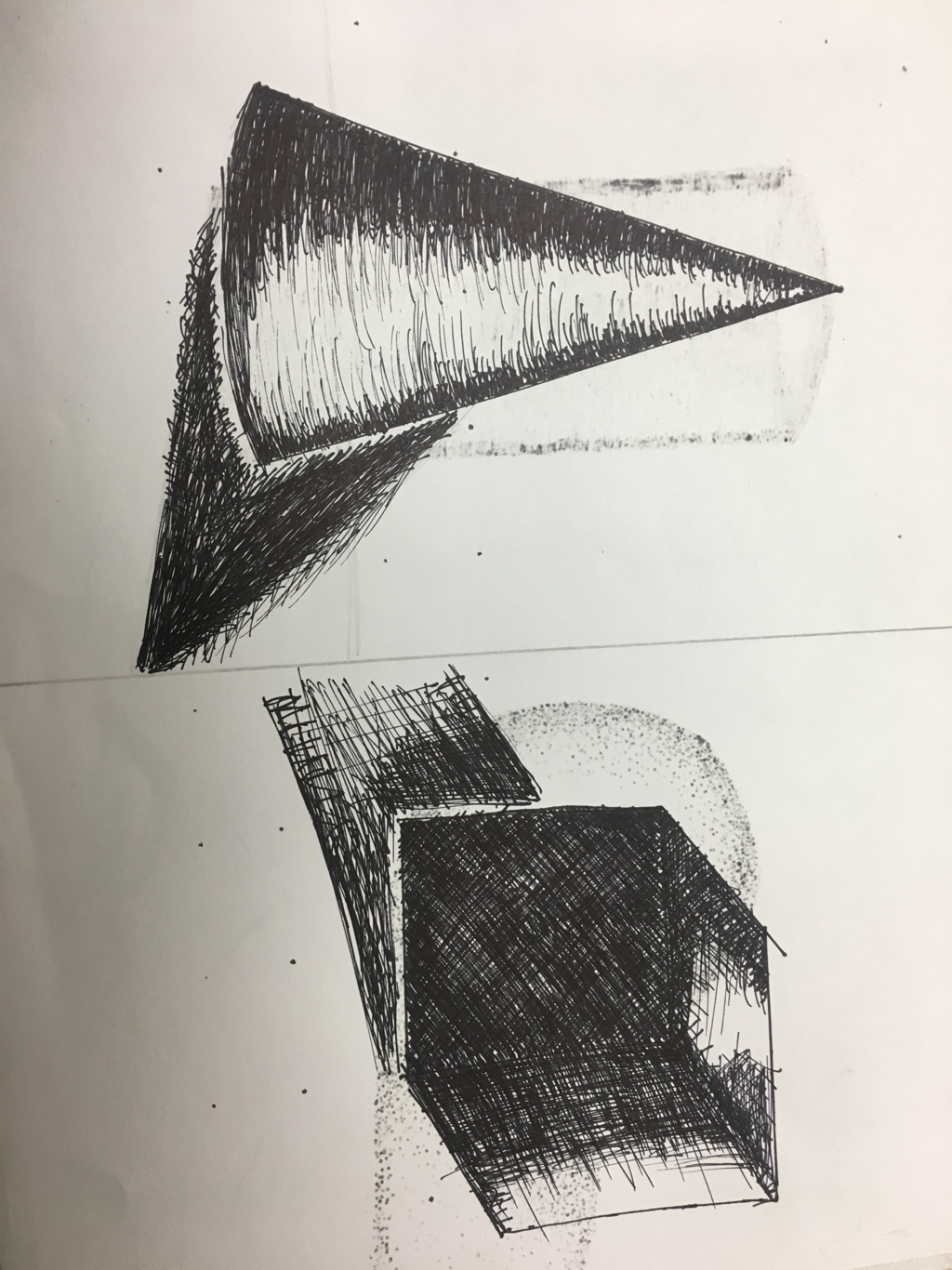
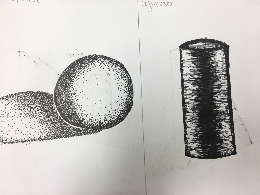
 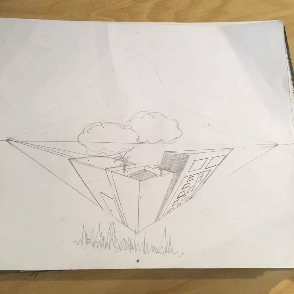 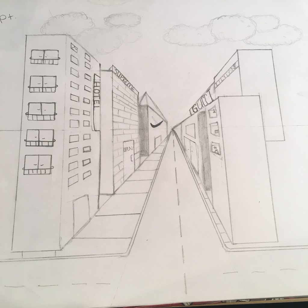 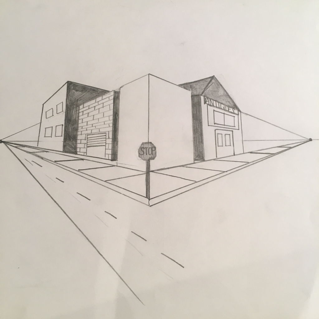 By practicing these techniques of different persepectives, i now have practice for the pen and ink perspective project. I learned a lot of new things by persuing these skills
|
AuthorWrite something about yourself. No need to be fancy, just an overview. Archives
May 2017
Categories |
 RSS Feed
