 practice pumpkin 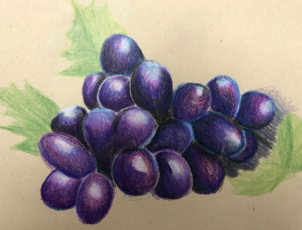 Practice grapes 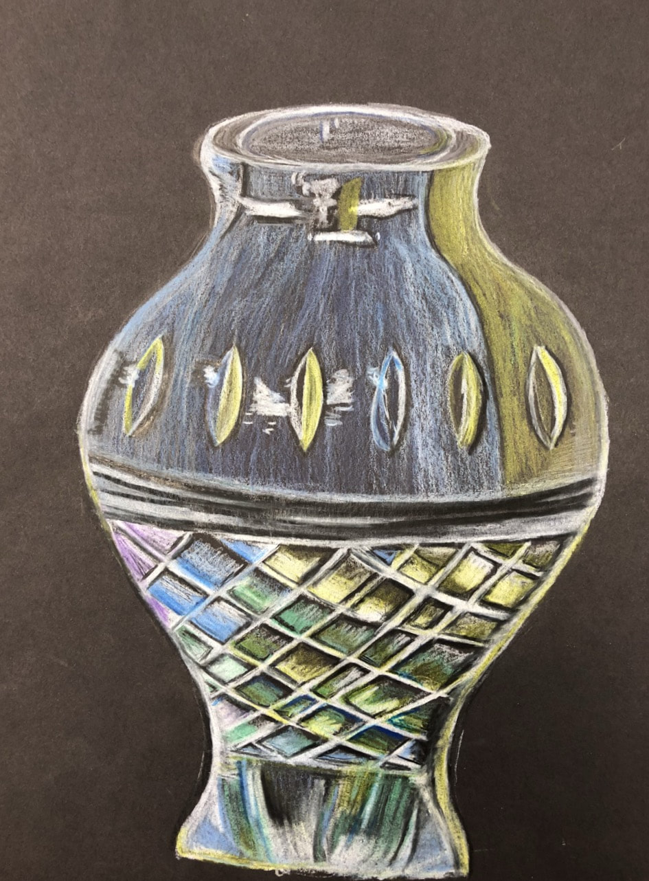 Glass 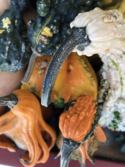 Subject for final Subject for final 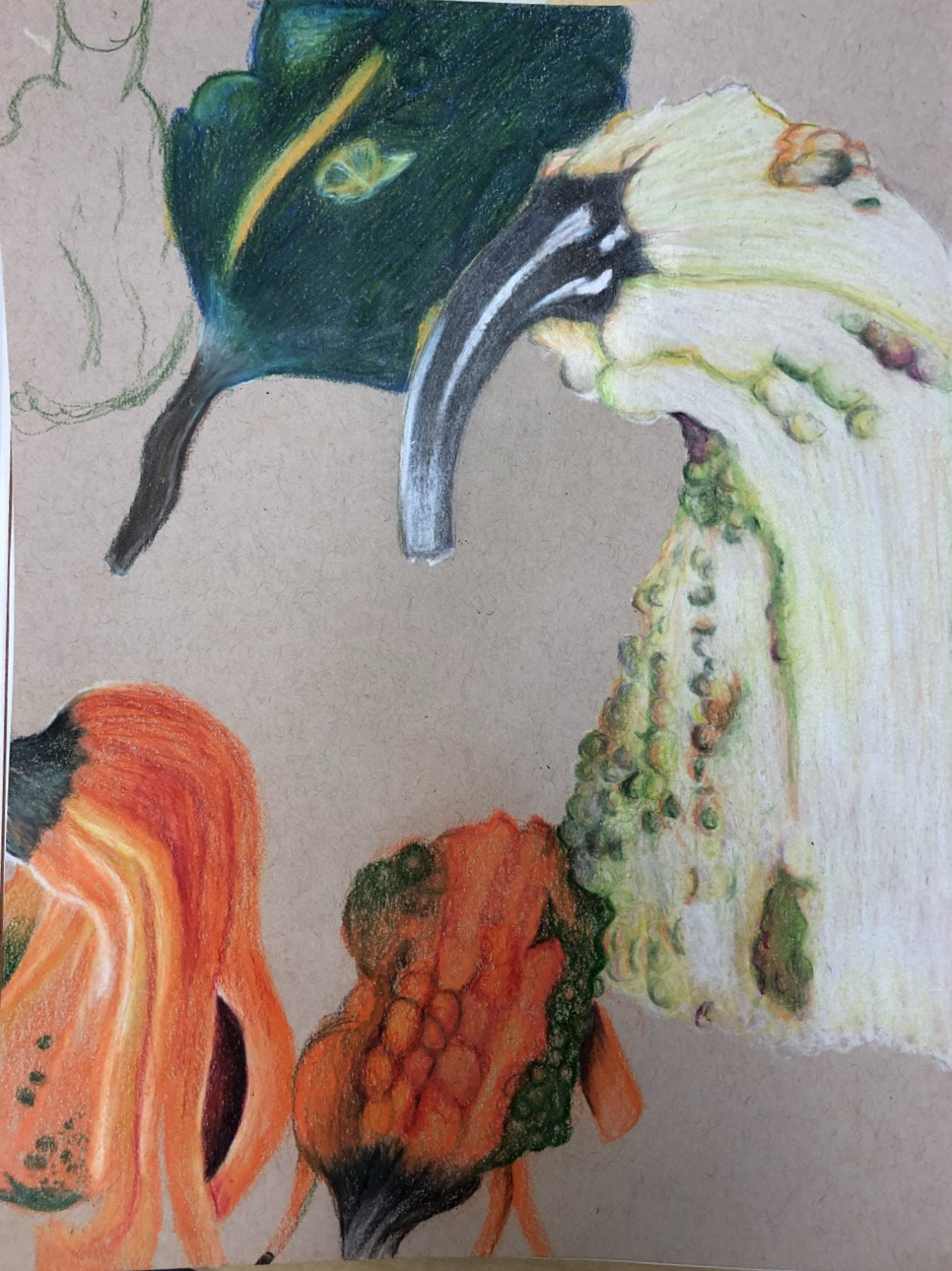 In progress 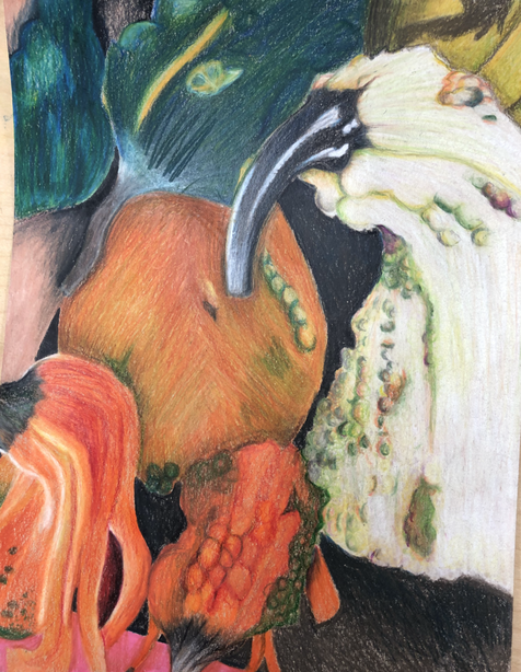 final 1) I tried to create an interesting point of view by showing foreshortening in the gourds as i took the picture from above and they are supposed to be coming forward, i was some what successful but i think the composition couldve been done better
2) It is important to show perspective in art so that your work doesn't look flat which makes it look more realistic and by adding value it really brings it all together. 3) the exercises we did before this project helped me to practice values and blending the prisma color, I love how you can get multiple shades and textures by using different colors. That's why i chose to draw something so colorful. 4)the techniques i used to create this piece really brought it together, i used shadows and highlights to show where objects overlapped or came forward. Using multiple colors really helped me to create a good amount of texture and to capture all of the values in the gourds. 5) I was able to create foreshortening by using dark darks for the foreground to show shadows and less darks for the middle ground and to bring it forward i used bright vibrant colors for the objects closest that needed the most emphasizes. 6) The obstacles i faced was once i reached burnishing i couldn't really add more colors in the first gourd i drew ( far right) so i couldn't create as much foreshortening in that one as i would have liked to. But luckily i started to use lighter pressure and more layers where needed in the next ones created. I think i had advantage in all the colors pictured because the key to prisma is multiple different colors to create value.
0 Comments
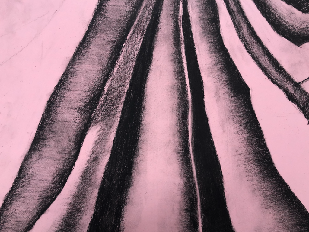 1) for this project I used charcoal which I am not used to at all, I tried my hardest to get a wide range of values but had trouble because it is so pigmented I think with more practice I can learn to get more values as I can with pencil
2) Practicing with values before doing this project really helped me because the only way to create the real ness of fabric is to use values , if I were to do this again I would use a lot more texture to show the flow of the fabric 3) I wasn’t very proud of my transitions in this work because usually they look more smooth, i saw very dark areas which I made black in my art but I think it should’ve been more light and blended into the other values. 4) creating Texture is very important because the look of fabric has a lot of texture that is hard to see but Is actually the main focus of the subject , I could’ve done a better job of this by using different line work and having more control over the values / direction of the lines 5) If I could recreate this I would probably use a different material , I think using white pencil on this would’ve created a better outcome because I could’ve enhanced the highlights more instead of the shadows , which I think is important in creating texture and value. |
AuthorWrite something about yourself. No need to be fancy, just an overview. Archives
January 2018
Categories |
 RSS Feed
